ZAKLINA.Z DESIGNS

PERSPECTIVE
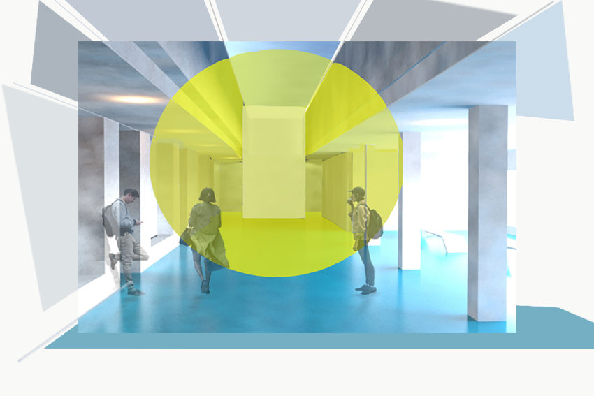
A narrow minded view on things might keep you from seeing the bigger picture, a space students will be excited and captivated by, the use of bright colours will uplift the current lifeless and absent feeling in level 5 which is the heart of the building, a connection between all the disciplines in the art school, and facility used by many other disciplines within the university. The two colours, yellow and blue are influenced by the constant complicated relationship between art and design as we constantly question the value of two different but very similar areas. Geometric shapes within the space are the reflection of the art school community and the equality between it’s students. The design works as a piece of art embedded within the interior, the art has the power for the viewer to explore the space through movement, from one point the viewer will see a 2D shape while exploring it from another angle it will become abstracted. The adaptive reuse has the intention for people to look outside the box an into the space rather than look down.
The experimentation of combining vivid colours into adaptive reuse space by Supermachine
was a major influence on the chosen colour palette within this design, playing with such vivid colours helps people to feel more awake and to experience the buzz of the creativity that is produced within the dated concrete walls. Work of Felice Varini provided encouragement to investigate different compositions of shape within the space.